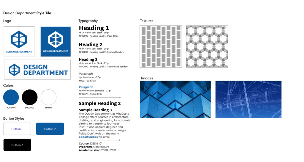
Above is the style tile I created for the website.
The client already picked out colors, logos, and typography which left me with textures, buttons, and images.
Button styles are usually straight forward. I tried to add some variety. At this point, I didn’t know what colors would go where on the website so I made a button with each color background.
It wasn’t likely that the Design Department would want my team to use textures, but we still created some. The first I took inspiration from a brick wall which reminded me of the Design Department architecture classes. The second is an intricate design I made only using equilateral triangles. This design was inspired by the first image from its repeating shapes.
The group chose my wireframes and layout of typography for the group style tile: