
I create mobile and desktop versions of two pages. The first is the home page and the second is the gallery page where student work would be showcased and categorized by class.
Low Fidelity
Home Page
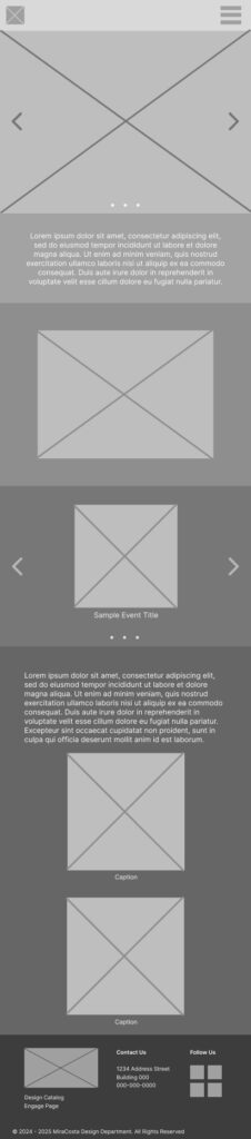
Top: Navigation
Section 1: Short “About” section
Section 2: Department video
Section 3: Events
Section 4: Study Abroad
Bottom: Footer
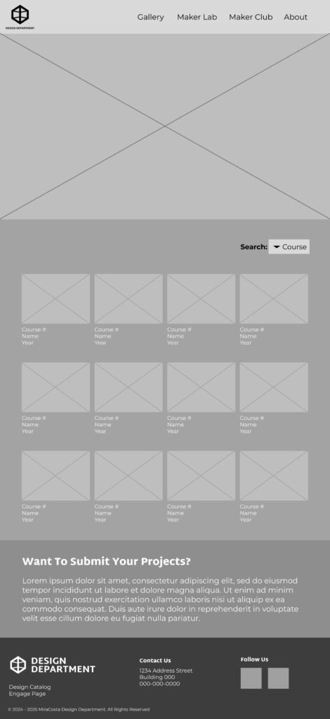
Gallery

Top: Navigation
Section 1: Gallery
- drop down with categories
- images with course #, name, year underneath them
Section 2: Want To Submit Your Projects?
Bottom: Footer
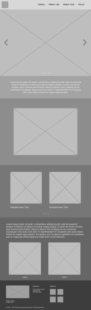
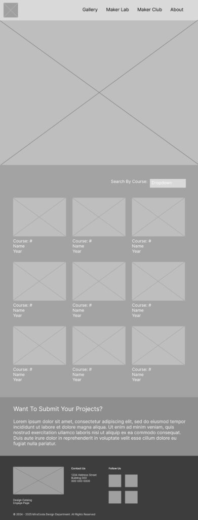
Mid Fidelity
The main differences between my LFW and the MFW is that I changed the fonts to the client picked fonts, and adding the logo to footer and header.
Other changes were also:
- adding buttons
- adding headings
- adjusting the footer content
- changing the Department video box into a 16:9 ratio
Home Page

Top: Navigation
Section 1: Short “About” section
Section 2: Department video
Section 3: Events
Section 4: Study Abroad
Bottom: Footer
Gallery

Top: Navigation
Section 1: Gallery
- drop down with categories
- images with course #, name, year underneath them
Section 2: Want To Submit Your Projects?
Bottom: Footer
My wireframes served as a baseline for the high fidelity wireframes which I did not create, but did revise and add some notes for errors and things to be fixed.
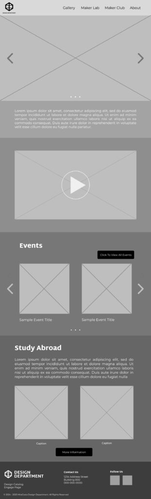
High Fidelity
A team mate created these and invited the group to look it over and make some corrections or ask questions. She’d later make these corrections or answer the questions and we’d revise again.
A notable change is that the study abroad section is no longer there on the home page and the “Want To Submit Your Projects?” is no longer there on the gallery page either.
Home

Top: Navigation
Section 1: Short “About” section
Section 2: Department video
Section 3: Events
Bottom: Footer
Gallery


Top: Navigation
Section 1: Gallery
- images with course #, name, year underneath them
- drop down with categories
Bottom: Footer