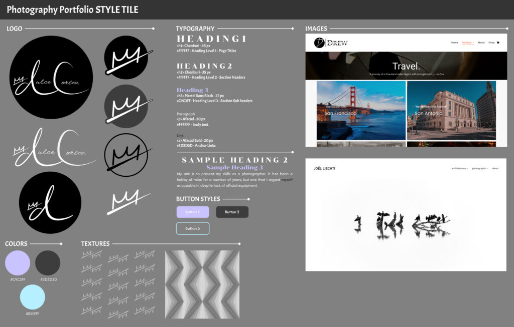
Logo
I based my logo off of my own signature which I had created months prior to designing the logo. I wanted a version of my logo to be contained in a circle like the logo on Andrew Hendrix’s portfolio.
I also made a purple version of the crown just in case I wanted to use it.


I had originally created this version of the logo, but removed it because in the future, the logo may not be used solely for photography.
After my professor took a look at my style tile, she suggested that I remove everything except the ‘d’ and the crown, instead adding my name in text instead. I followed the advice and created the logo that is currently being used on my portfolio site.
Colors
I try to keep the 60, 30, 10 rule in mind when picking colors. It’s a rule that’s used for character design, but I find that it works well with website color schemes. The rule is to pick three colors; 1 that is used 60% of the time (the dominant color), 1 that is used 30% of the time(compliments the dominant) and 1 that is used 10% of the time (details). I originally learned of it from this tumblr post by Tomatatoro.
With the web, it’s important to keep things simple to not bombard the user with too much visual information or stimulus and to keep the size of the website small so it loads faster(which is why it’s recommended to use only three fonts max on a website).
I chose gray because I wanted my website to be on the darker side or at least have a dark header and footer. Personally, I find darker colored websites to be easier to navigate and more visually pleasing. In addition, it’d be fitting to have the website represent me in some ways so I chose a light purple/lavender which is my favorite color. The sky blue color was picked for any details that I didn’t want to be purple.
Typography
I chose the font “Afacad” which is the one I’m currently using now. It’s easy to read and letters such as “a,” “e,” “o,” and “c” use circles as a base. It also has different variations such combinations between regular, bold, and italic styles. This font would also be used for links.
The second font is “Chonburi” which would serve as the headings. I opted to add some letter spacing for a splash of uniqueness, but also to differentiate the larger headings from the smaller ones.
Textures
I wasn’t planning to use textures for my website, but it’s still useful to create some just in case and also for some added design practice.
The first design I created offset rows of the Crown Only version of my logo.
For the second, I took inspiration from a presentation I made in the past, layering triangles of different widths and values together and then duplicating them over and over.

Buttons
I chose three main colors and used each color on one button.
The blue was quite bright so I felt it was best it became a border instead of making it a background to white text.
Buttons are better off simple and the time of the design of this style tile, I did not think I would be using buttons.
Images
I took screenshots from the portfolio websites of Andrew Hendrix and Joël Liechti.
I liked the way that Hendrix’s categories were organized with text on top of an image which linked to the rest of the gallery. As stated before, I also too inspiration from his capital ‘D’ portion of his logo.
On Liechti’s site, I liked the minimalism of the home page. A portfolio website is pretty straightforward and if it is only being used to showcase work, it doesn’t need too much on the home page.