To begin this project, my group and I decided on this logo and the name: DMMC Studio.

Another team member drafted the content using AI and I organized it into a google document.
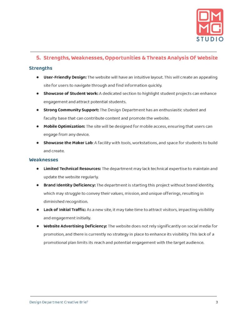
The basic design I came up with is below:
Logo: Top right of the header so it appears on all pages and it won’t interfere with stapling in case it is printed
Headings: In the red from our logo and the largest font size to create a hierarchy. They are also numbered. It helped when we edited the content because we referenced the numbers instead of the names
Sub Headings: In the blue of our logo to differentiate between the headings, but also from the content
Bolded Text: to discern a topic from the description of the topic
Design Department Creative Brief & Page Numbers: In the footer so it appears on every page

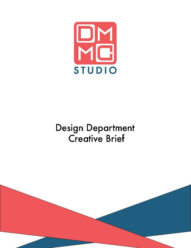
After the basic layout was created, it was time to edit the content. Much of the editing was reading through everything to humanize it and make sure the AI didn’t add anything we didn’t want. Once the editing was done, I designed the cover page in Photoshop.

Logo: Large and in the middle top of the page so it grabs the attention of the viewer
Title: In black to stand out from the red and blue
Triangle Design: The page needed another splash of color as well something to fill the space, but an intricate design would take too much attention from the viewer. This is a cover page so the purpose is to convey information of the contents and by whom it was made.
I had made a presentation years ago that had colored triangles in the corner to add more color and fill some of the space. I
created two right triangles and played around with their placement until I landed with the design above.
After that, I put the document together using Adobe Acrobat and sent it to the client.
